Following these best web design practices will help you develop a good design for your business or nonprofit website.
But how do you determine good website design? The answer has little to do with choosing nice fonts and pretty colours. Read on to find out why.
Why non-designers need to know best web design practices
This article isn’t written for website designers, who don’t need our advice. So who is it for?
First, it’s for anyone preparing to work with a website designer to build a new website or give an existing website a design makeover.
Reading this article will help you plan your website and write a website brief. It will also help you understand the decisions your designer makes for your website and enable you to nudge them into using any best web design practices they have overlooked.
Second, this article is for people wanting to make small improvements to their current website.
Change is the only constant on the internet, and change happens faster here than in the offline world.
Your website may have been cutting edge when launched but today could be driving your target audience to seek out your competitors. That’s a leak you need to plug.
Finally, this article is for people designing their own website.
As you will see, design strongly influences people’s behaviour when browsing a website. As such, DIY web design is not highly recommended, especially for mission-critical websites.
Nonetheless, with the wide availability of professionally designed website templates, DIY web design is not impossible to get right. It’s a good approach when funds are limited. This article helps you make good design decisions for your website.
Get in touch for an obligation free chat about your website project
Why using web design best practices is important
Web design is all about making websites look good, right?
Well, yes, but there’s more to it than aesthetics, so let’s try again:
Web design is about making websites look good and be easy for audiences to use.
Getting there, but there’s even more to it than aesthetics and user experience, so let’s give it one last shot:
Web design is about making websites look good and be easy for audiences to use to achieve the website owner’s goals.
That’s better. And now you see the importance of good web design.
You see, on the surface web design is all about pleasing website users. But underneath good web design works to ensure website owners get what they want from their websites.
So, what are the goals you need best web design practices to help you achieve?
The answer is found in the reason you have a website in the first place.
Most websites – and probably all business and nonprofit websites – should exist to achieve identified goals.
Website goals can include intangible outcomes, such as raising brand awareness or educating people about an environment issue, but practically all websites should have tangible goals with specific, easily measured outcomes.
In webmaster geek-speak these outcomes are called conversions. A conversion happens when a user takes an action on a website, such as:
- Purchasing
- Enquiring
- Subscribing
- Donating
- Volunteering
But, here’s the thing – website users are far less likely to convert on websites they don’t like.
Visually unattractive websites, clumsy websites, old-fashioned websites, complicated websites, confusing websites – poor website design erects a barrier between website visitors and the call to action button.
How big a barrier? Brace yourself for some shocking website design statistics:
- First impressions are 94% design-related
- 88% of online consumers are less likely to return to a site after a bad experience
- Judgments of website credibility are 75% based on a website’s overall design
- 38% of people will stop engaging with a website if the layout is unattractive
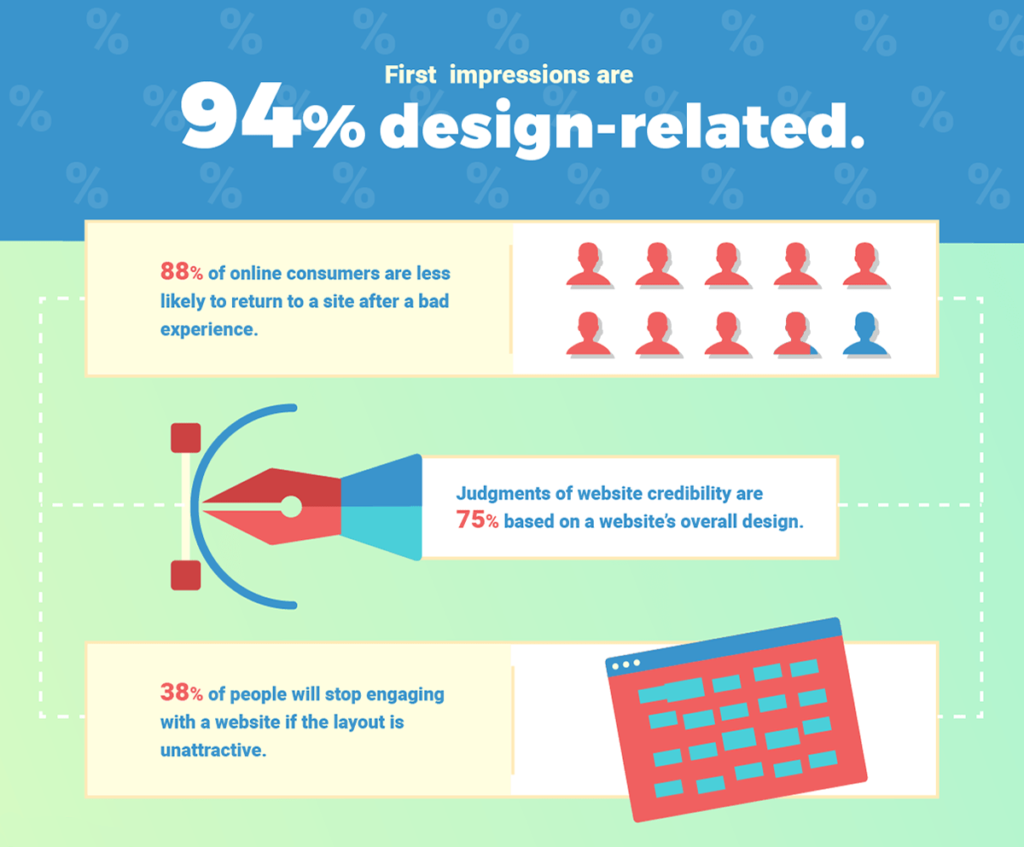
Poor first impressions, bad experiences and a perceived lack of credibility greatly reduce people’s trust in the organisation represented by the offending website. And trust is crucial for removing people’s objections to taking action (converting) on a website.
So, web design is important because it breaks down the barriers that stop people converting on your website.
Using best web design practices helps turn your website into a valuable contributor to your business’ or nonprofit’s success.
Failing to use best web design practices turns your website into an electronic black hole that sucks in resources and gives nothing back.
Your audience’s role in your web design decisions
You have seen that web design is important because it breaks down the barriers that stop people converting on your website.
Because of this, it doesn’t matter what your boss, manager or CEO likes when it comes to web design. And (sorry) it doesn’t matter what you like.
All that matters is what your target website audience likes. Audience preference determines good website design.
And who is this all-powerful audience?
They are the people you need taking the actions needed to achieve your website goals – your purchasers, enquirers, subscribers, donors, volunteers…
So, the following web design best practices should be implemented with your target website audience’s design preferences in mind.
For example, when choosing your website’s fonts and colours think about (or better, find out) the fonts and colours your audience prefers.
This concept becomes obvious when you consider audiences greatly different from yourself. It’s easy to imagine that pre-teens (10–12 years) probably have different design preferences to anything you like. But the same idea applies for all website audiences.
Web design best practices to use on your website
Remember, good website design is about what your target website audience likes, not what you like. So, apply the following best web design practices from the perspective of your intended website audience’s design preferences.
Rules are made to be broken so practices can be ripped to pieces!
Hmm, tempting. After all, a radically different website could get you noticed. If you’ve read this article so far you know how to respond to this temptation. Embrace it and scrap the following web design best practices if you think your audience will appreciate that. Ignore it if you think they would not. And check what your competitors are doing with their websites before opting for a radical design, because that’s what your audience will do if they struggle with your website.
Keep it simple
Keep it simple is the one web design best practice to rule them all. When faced with a design choice, choose simplicity.
Be consistent
Use the same design elements across all web pages. For pages you want to stand out from other pages simply change the layout. Retaining design consistency across all pages gives users the assurance of knowing they are still on your website.
Design consistency should continue between your website and offline communication channels (e.g. printed brochures; shop signs) to establish and reinforce your organisation’s brand. Maintaining a consistent brand across all channels builds audience awareness of, and trust in, your organisation.
Minimise choice
The more choices you offer, the harder it becomes for people to make a decision.
Avoid analysis paralysis by reducing options, especially on your home page.
Instead, focus people’s attention on the main thing you want them to do as a result of visiting a page on your website, which brings us nicely to our next point.
Use clear calls to action
Achieving your website goals requires people to take action on your site. But few people will take action unless prompted or if the means to act is hidden.
So, include a clear call to action on every page of your website.
Take a look at the call to action on the home page of our Social Change portfolio website. The big orange donate button stands out clearly and the reason why people should donate is succinctly stated – so no child goes hungry.

Also notice the second donate button in the header. It is OK to have different calls to action on the same page, but take care not to confuse your message or provide too many choices.
It’s also a good idea to add some short text to remove objections people may have to taking an action. For example, placing ‘Cancel anytime’ under a button for a subscription service assures people this is something they can easily get out of.
Make navigation easy
Make it easy for people to find their way around your website.
A standard website layout places your core web pages (e.g. Products/Services; Blog; About) exactly where people expect to find them. Yes, this stifles originality but this isn’t about breaking new ground, it’s about not losing visitors because they can’t find what they’re looking for.
Keep your primary navigation menu simple with a maximum of perhaps seven headings (remove Home for an easy win and link your logo to your home page).
And call pages by the name people expect them to be called, for example, Contact rather than Enquire.
Good website navigation makes people’s journey around your website as easy as possible.
Make use of negative space
Negative space is the areas between design elements. It’s the gaps with nothing in them except the background, which may simply be white space.
The role of negative space is to break up design elements and emphasise important features, such as call to action buttons.
Clutter and crowding is the enemy of good design. Simplicity and clarity is its friend.
Stick to two fonts
Sticking to our keep it simple philosophy, use just two fonts across your entire website:
- Font one – Headings of all sizes (i.e. H1 to H6)
- Font two – All other text (i.e. paragraph text)
It’s perfectly OK to use the same font for headings and text.
OK, if you insist:
- Font three – Used sparingly to emphasise key text or for your logo
Some fonts work better together than others. This generator helps you choose good font pairs for your site.
Use a simple colour palette
The best web design practice for website colours is to use two main colours with perhaps a third colour to highlight important features, such as call to action buttons.
Other colours on your website (e.g. backgrounds) should be tints of the main colours. If one of your colours is not suitable for text use a dark grey (as most website do) or black. Make sure your text is dark enough for people to easily read.
This is a practice you can play around with to some extent by introducing additional colours (you know, depending on audience preference).
Some colours work better together than others. This generator helps you choose a good colour palette for your site. Set the Color Harmony Rule to your requirements.
Keep text to a minimum
Few things are as sure to have people bouncing off your website without looking around than a solid wall of dense text.
However, writing website content isn’t easy. In as few words as possible you need to communicate your message so that people understand your meaning.
Start by writing what you want to say and then edit your text to remove superfluous words. Check the meaning then edit it again. And again. Sleep on it for a few days and then edit it some more. Ideally you will also test it on audience members to make sure they understand.
It’s not a bad idea to write your website text before your website designer starts work so they know the text they need to incorporate into their design.
Alternatively, let them design your site using placeholder text and rise to the challenge of fitting in what you need to say.
Personally I prefer the first approach, but listen to your designer’s advice, especially if you have struggled to reduce the word count or clearly communicate your message.
There are some exceptions where more text is acceptable, such as your About page and blog posts. But even here you should fiercely edit your text and break it up with design elements.
Get Content That Converts
Turn passive audiences into action takers with Trailhead Studio content solutions for your online and print communications.
Use appropriate visuals
Visuals play a crucial role in website design.
But not just any visuals – picture and illustration quality is important for instilling trust.
If you have the budget consider using a professional photographer or illustrator. Do this in conjunction with your website designer to ensure you get the visuals you need.
You can also consider using your own photos. In fact, for some websites, such as student and political advocacy sites, a homemade look may be more appropriate than a highly polished professional look.
Finally, turn to stock libraries, but consider using paid images as the free images have been used extensively and may be familiar to your audience.
Best web design practices conclusion
You now know some of the best web design practices in use today. They’ve become best practices for a reason – they work. And by work we mean they should result in more conversions on your website.
So, implement as many of them as you can and contact us if you need a hand. We have a no task too small support policy and we’re happy to help.